Designer: Brad Shellhammer; more details below.
By Carl J. Dellatore

The color red is shot through the centuries, like threads weaving a rich tapestry of meanings and symbolism that has evolved across diverse cultures and epochs. In ancient times, red often symbolized power, passion, and vitality. The Egyptians associated it with the god of chaos, Set, while the Romans linked it to Mars, the god of war, highlighting its connection to strength and conflict.
In medieval Europe, red took on dual meanings. It symbolized wealth and luxury, as only the affluent could afford the expensive red dyes derived from cinnabar and minerals. Simultaneously, it became associated with sin and temptation, as seen in depictions of the devil in religious art.
As time progressed, red continued to acquire multifaceted connotations. In Eastern cultures, particularly in China, red is a color of good fortune and happiness, often used in celebrations and weddings. In contrast, Western cultures began associating red with danger, stop signals, and caution.
In the realm of emotions, red remains synonymous with passion and love. The red rose has long been a symbol of romantic love, transcending cultural boundaries.
The meaning of the color red continues to evolve. It represents energy, excitement, and urgency in advertising and branding (think Coca-Cola and CNN) while symbolizing solidarity and awareness for various social and health causes (think the AIDS ribbon and CVS). The varied meanings of red throughout history showcase its versatility, reflecting the ever-changing nuances of human perception and cultural significance.
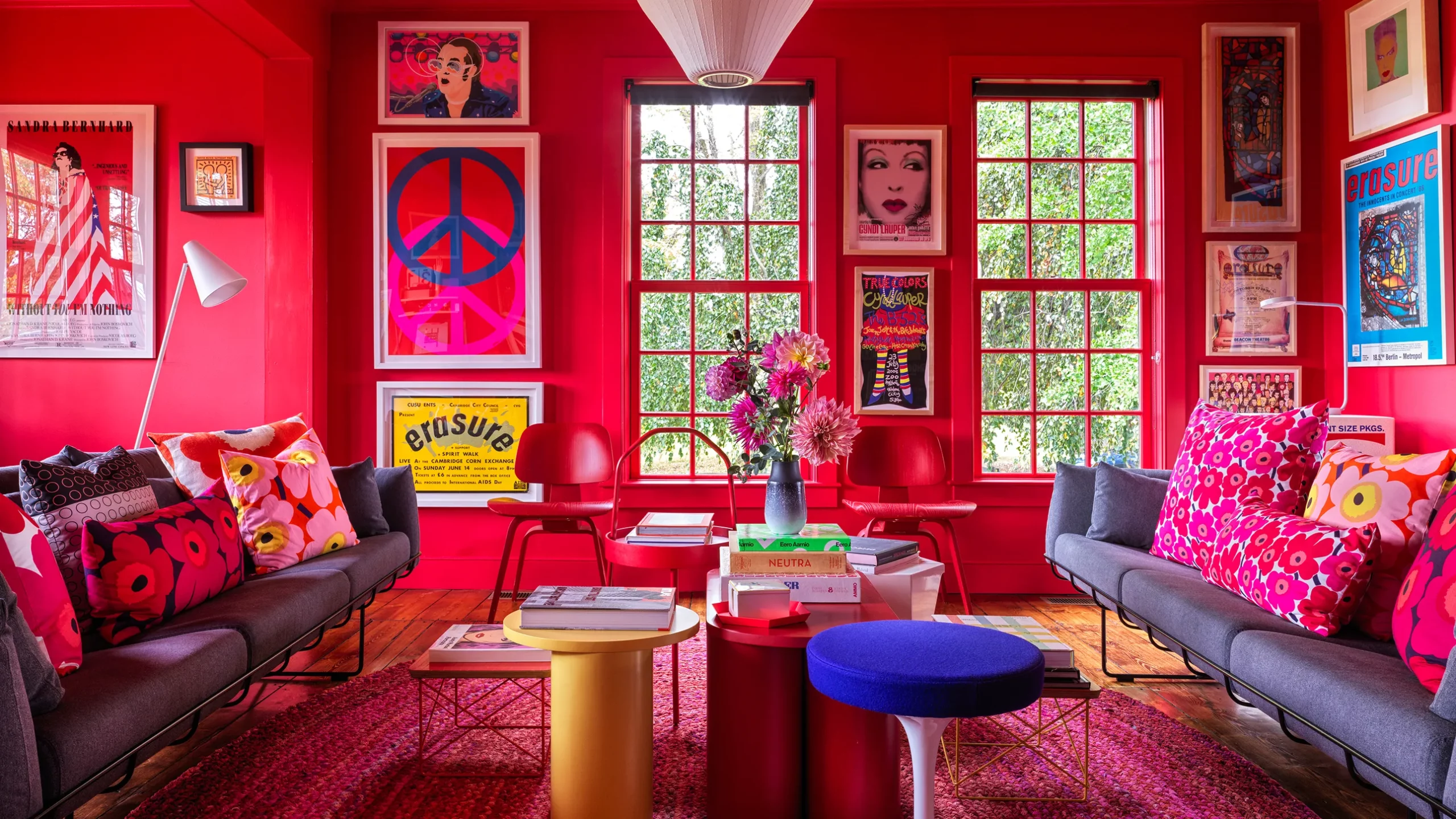
Red is not often predominant in interior design, but when designers choose it, it is a powerful tool to evoke emotions and create impactful spaces. The use of red in interior design ranges from subtle accents to dominant focal points, depending on the desired effect. The ubiquitous “red library” comes to mind.
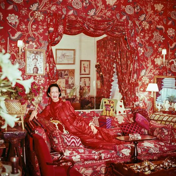
On the subject of dominant focal points, it’s impossible to forget Diana Vreeland’s iconic living room, famously known as “The Garden in Hell.” The legendary fashion editor created a flamboyant and theatrical space with an assist from the legendary decorator Billy Baldwin.
The room was adorned with whimsical elements, including zebra-printed carpets, red floral chintz walls, and vibrant cushions; the juxtaposition of exotic influences, such as Chinese porcelain and Moroccan textiles, showcased Vreeland’s love for global aesthetics. This eclectic mix of styles and textures transformed her living room into an unconventional sanctuary, perfectly mirroring her unapologetic and trendsetting approach to fashion and style. The space remains an enduring symbol of Vreeland’s fearless creativity and ability to turn the ordinary into the extraordinary.
Two modern-day red rooms come to mind. As it happens, Los Angeles-based Mark D Sikes and Chicago-based Alessandra Branca were given adjacent spaces to decorate in the Kips Bay Decorator Show House in the spring of 2015. (See both in this “The New York Times” article.)
Sikes’ space was a gingham-clad dining room, which he told me was inspired by Marella Agnelli, while Branca’s ticking-striped living room brimmed with English antiques anchored by a vast Chinese screen. Both spaces were a master class in using red to great success.
In subsequent years, I had an in-depth conversation with Branca about employing red in interiors. She had this to say, “Red’s richness varies immensely depending on the effect of light, context and material. Blue-based reds and yellow-based reds are worlds apart, and yet they can be mixed with great success in interiors. Paints soak up red pigment like a sponge, and that changes their intensity. Upholster red felt or fabric on a wall, and that same color commands greater attention and depth.
“Light changes red, too, causing it to read differently in every region of the world and every season. Terra cotta-red walls in a living room in Rome look vastly different from the coral red in the Bahamas, the rugged reds of the American West and the refined red of a New York City apartment. Textures get in on the game as well, from the luscious red of mohair velvet to the luster of the lacquer on a japanned screen to the warmth of red fibers in an antique Turkish rug.”
Ultimately, using red in an interior is an impactful choice for evoking emotions and setting the tone for a space. Its ability to create warmth, drama and a sense of excitement makes it a valuable tool for designers seeking to make a bold statement in their work.

Stay updated on this series author, Carl Dellatore, by following his Instagram. About Carl Dellatore & Associates – provides designers, architects, and creatives with writing, editing, and copyediting services by an established team to effectively reveal your story.